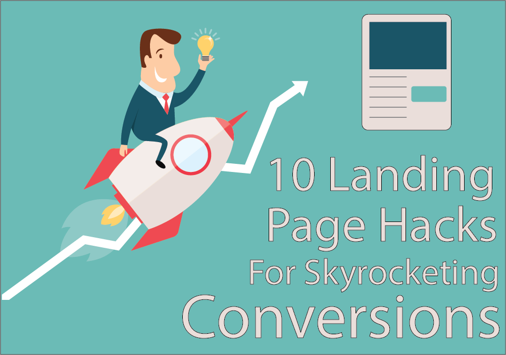
Today I am going to share some of the best tips and tricks that you can implement on your landing page to skyrocket conversions. Before I dive right in I would like to cover the importance of conversion optimization a bit.
Landing Pages are the key ingredient for getting potential leads for any business. Sometimes we refer to them as squeeze pages since their soul purpose is to squeeze information for anyone viewing them. Some of the most common ways a business can use an optimized landing page are:
- Email opt-ins
- Free Downloads
- Webinar Registrations
- Lead Generation
BONUS: 15 Landing Page Design For Inspiration [2015]
A lot of you have asked me how you can optimize your pages to get better conversion so I finally decided to share some of the tips and tricks I personally use with my own landing pages for various clients. These tips and tricks will vary from changing the very subtle of things to something that you should try entirely different. Over the course of this blog post I will show you relevant examples of landing pages but unfortunately I cannot disclose the actual pages that I have been using due to various non-disclosure agreements between me and the people I work for.
1. Generate a Catchy Headline That Sticks
The first thing that a user experiences once they visit your landing page is your headline. I cannot stress enough how important it is to have a catchy headline because if it’s generic then the chances are they will abandon your page without even going through the whole content.
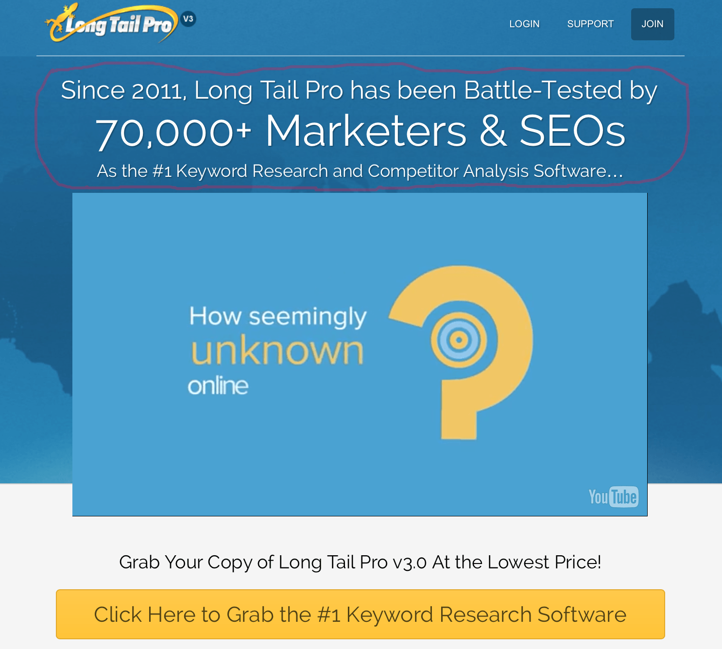
Check out how the heading is divided into 3 parts with the second like showcasing no. of people using the software
3 Steps Process For Effective Headline
Word Count – 6-7 words focussing on adjectives and verbs. The headline should contain the main offer or topic for your landing page.
Bolder And Bigger Text – Yes, I have actually seen people using heading and sub-heading text with the same font size. The headline should be defiantly in a bolder text compared to the rest of the content. It should have a bigger font size than any other content in the page.
Initiate Curiosity – An easy way to improve conversion rate is to initiate curiosity of the user visiting your page. However, I should warn you that this method might backfire in some scenarios so make sure you run an A-B test to see if this headline is working well with users. Basically, what you do is ask a question that the user is desperately looking a solution for. That should initiate their curiosity. The headline should be followed by an action that the user needs to take in order to find the solution and this is where you use your Call-To-Action (CTA) button and convert them into a lead.
A-B Test Call To Action (CTA) Buttons
The Call-To-Action (CTA) button is the tip of the sphere when it comes to your landing page. You must ensure that the CTA button initiates user to take an action in order to get something valuable in return. Do not use plain words like “Submit” or “Send” when you are using a form alongside your CTA button. Instead use something like “Download E-Book Now” or “Get My Free Report” in order to initiate the user to take action.
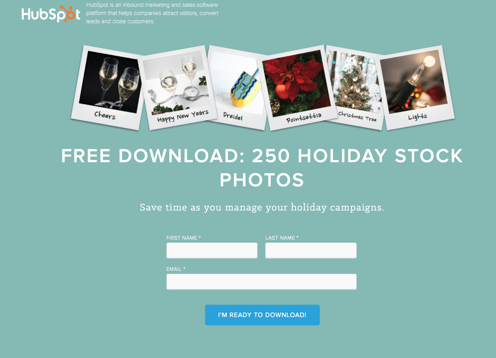
BONUS: 50 Customizable Call To Action (CTA) Button By Hubspot [Free Download]
2. Use Specific Form Fields That You Require
Whenever a user visits a landing page they are trading their information in some form or another. Getting information from leads is a two way street and I often say this to webmasters deciding on which fields they should include on the landing page. Traditionally the more form fields you have on your page the lower will be your conversion rate. Unless you are a huge trusted brand like Hubspot or BMW keep your form fields minimal.
What Fields To Include – Here are some quick tips that you should consider when deciding what form fields you should include on your landing page.If you are doing a giveaway that is fairly similar to what your competition is doing then stick to just an email address field.
If you are looking to personalize the lead nurturing campaign then you should include a first name field with the email field so that you can send personalized emails once someone opts in.
The general rule of thumb is that the higher your revenue per customer the more form fields your users are likely to fill. For example if you are an accountant targeted small to medium business owners, you can add fields like size of company, phone number, average revenue per year and other related fields. However if you are doing a simple template giveaway then there is no need to ask for their company size, phone number etc.
- Try to do a A-B test of two different forms in order to see which converts better.
- Sometimes using icons inside form fields boosts conversion.
3. Use Heatmaps to Monitor And Adapt Your Design
Heatmapping tools like Crazy Egg and Sumo Me allows you to track how users are reading and browsing through your page. This allows you to see the parts of your landing page that are getting more attention as well as how they scroll through your content. This valuable data can be used to your advantage.
Take a look at the red areas in your heatmap report. You should try altering the layout of your landing page by placing key elements like the CTA button, headline etc. in these areas. Try doing a split testing and I am sure you will get better results.
4. Try A Video Landing Page
Here is another sure shot way to get more leads. Instead of using images to explain what your page is all about simply use an effective video on the landing page. Take a look at the mockup below where I show how you can integrate a video to your landing page.
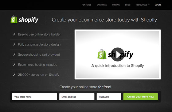
All the major landing page software allows you to inert a video. I personally think hat you should let the video autoplay once someone lands in your page. Keep the content of the video short and to the point allowing you to get the maximum user attention as well as heighten their curiosity. If you are using WordPress then you can simply use an embedded YouTube video ro go with a custom video player. One last advise about video landing page is that the form or offer button should be in the same frame as the video. Do not make the user scroll down to get the offer.
5. Selecting The Right Colours For Your Landing Page
Changing the colour for certain elements also leads to better conversions. I have seen this happen a number of time and I think I found my list of favourite colours that converts well for any niche. Well, rather than a list I should explain you how the whole methodology behind the whole colour thing works.
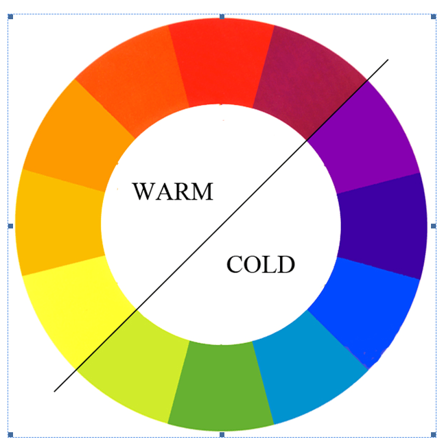
Colours play an important part in grabbing the attention of any customer. I am a part-time graphic designer and If I were to write about colour and it’s implications on web-design then this would be very long post. I will simply stick to the basics and educate you on certain key things that you need to understand while selecting the overall theme and look of your landing page.
Here are some of my recommendations when playing with colours:
- Use warm and cool colours depending on your brand and the type of product you are promoting. For example, if your brand is about a productivity software then use your base colour as light green or sky blue whereas if you are pitching an e-book about a food truck then use warmer colours.
- Use contrasting colours to focus on what’s important. A dark background with light text colour is a perfect example of driving user attention.
- Never use darker text colours for Call To Action (CTA) buttons.
- Keep a simple colour palette for your landing page. Do not use too many colours because it’s very distracting and can lead to higher bounce rates.
6. Use Lists Or Bullets To Highlight Key Points
An average user will decided whether to opt-in or out within 20 seconds of visiting your landing page. This means you are literally running against time to score a conversion. In such a scenario, it’s best to use lists or bullet points to highlight some of the key points and make sure that they are relevant to the visitor.
If you are offering a free e-book download then make sure that the bullet points cover the key topics of your e-book. Sometimes key highlights of why someone should click your CTA button works wonders. These checklists are a vital element for improving conversions rate. You should add a nice check mark image beside each of the points or arrange them numerically. Try to play with the overall design of your checklist area and make sure it flows naturally with the overall design of your webpage.
7. Highlight Testimonials To Boost Conversion
Real world examples of people using your product or service is always helpful when trying to convert potential leads into customers. Testimonials are a sure shot way of getting more conversions simply because they increase the trust factor in your product.
Ideally testimonials are placed below the main offer and often contain the person’s image as well as their designation. For example if you are pitching a blogging course then you can use testimonials from people who used your course to be successful. Add a link back to their blog to make the testimonial more credible.

Often people will contact the testimonial writers and then return back to your offer. The most important thing about the testimonial is that the text itself should be very clear and easy to read.
8. Never Use Navigation On A Landing Page
This is going to be a short tip but quite important nonetheless. Never ever use a navigation menu on your landing pages. Not only is it distracting but you are pushing your content down from above the fold. A landing page is designed to get someone’s information or direct them to take a specific action. The general rule of thumb is that the more laser focused you content, the better the chances of conversion. You can always redirect them to any URL after your have achieved your objective.
9. Convert Abandoning Visitors With Remarketing
I covered the topic of remarketing for conversions in a previous article. I highly suggest you check that out because it will help convert more visitors especially abandoning visitors into potential leads. The concept of remarketing is simple enough and is often used by some of the most popular brands on the internet.

You can add a tracking code to your landing page allowing users to get tagged and once they abandon your website you can target them using Google Adwords as well as Facebook and other social media advertising. This gives you a second shot of converting visitors into leads and the cost of remarekting is quite low compared to other types of online advertising.
10. Use Multi Step Method To Drive User Engagement
If you ask me of the single biggest trend for all landing pages in 2015 then it has to be multi step opt-in. Multi step opt in is where the user takes a series of actions in order to submit their information. For Example, your landing page can have a CTA button and when the user clicks on it a a form pops up allowing them to sign up.
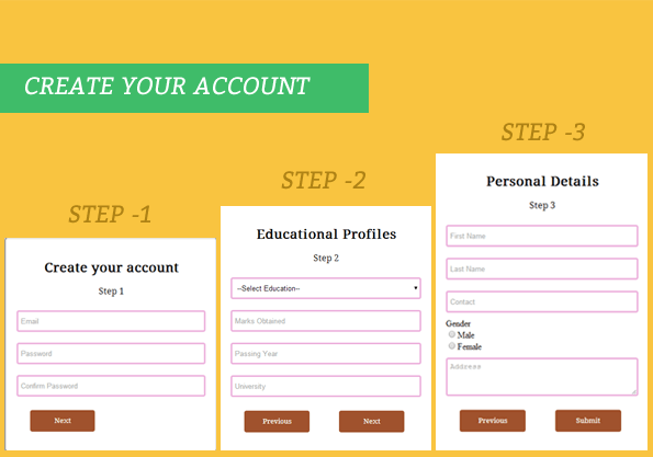
Multi step opt-in focuses towards more user engagement then traditional opt-in techniques and leads to better conversion rate. As a matter of fact I have tested this type of opt-in for file downloads and it worked like a charm. This technique also works if you are planning to use a long form then break it up into several steps.

0 Comments