Landing pages are key to any successful online campaign. Whether you are promoting a new offer for your business or trying to get leads for your new loyalty card program, you can overlook the importance of landing pages on your website. As a matter of fact landing pages are a key part of the inbound methodology process. Today I am going to share some of the recent landing pages that I found quite interesting on the internet. I will go through a brief overview of each one of them and ensure that you have a understand of why they are using certain things and how it leads to better conversion rate.
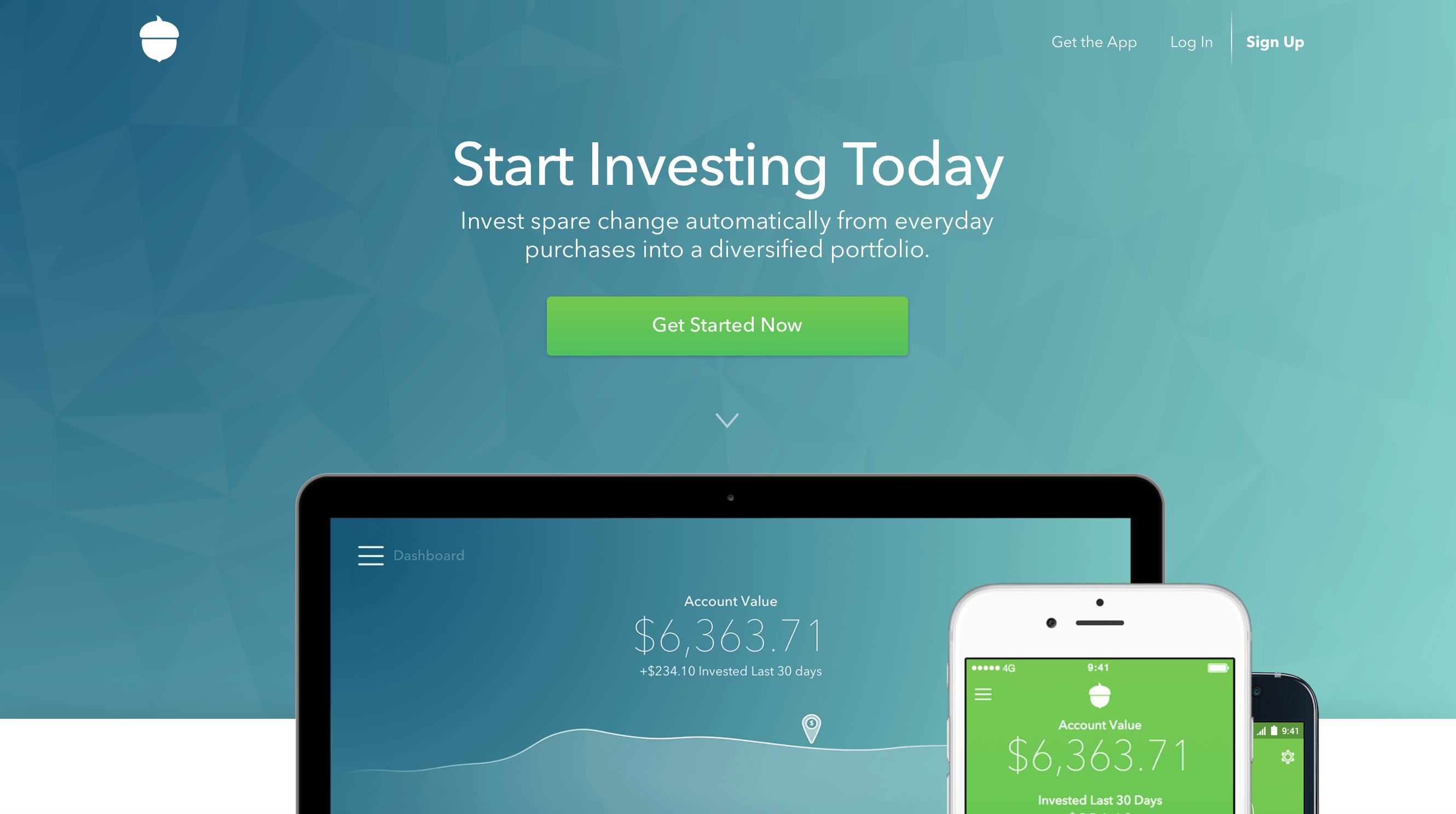
Acorns – Using Motion To Attract Attention
Acorns allow you to invest spare changes into a stock market portfolio which would eventually payoff a healthy return over a long period of time. While the concept may seem a little complicated at first, they did a great job with their homepage explaining how the entire process works. As soon as you browse to their website these CSS3 animations captures your attention. While scrolling down you can see that the landing page is divided into different interactive segments with harmonious colour transitions.
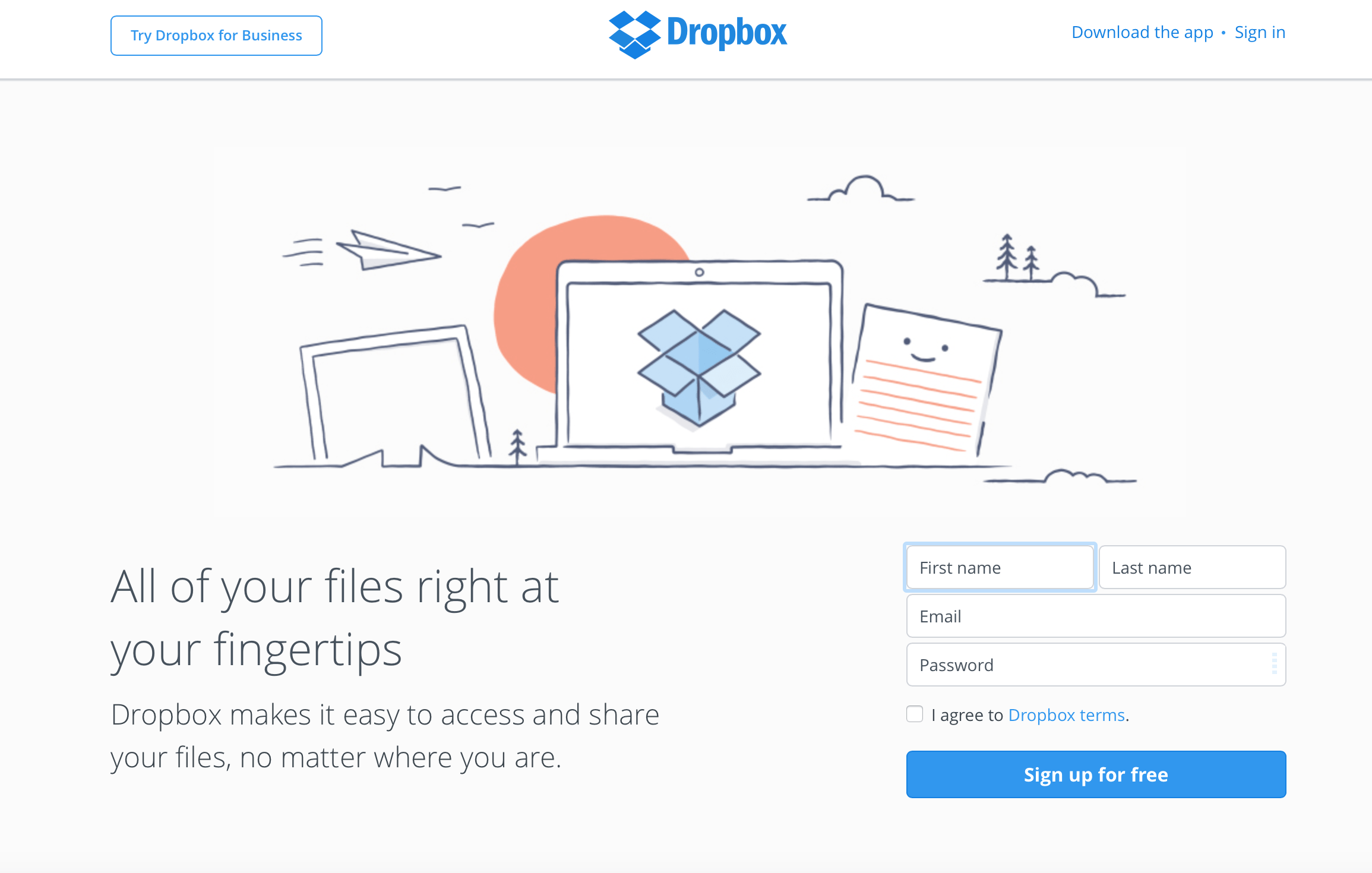
DropBox – Effectively Incorporating Navigation in Landing Page
If you browse to Dropbox’s homepage you are resented with lots of whitespace and simple illustrations. A form to sign up for their service can be seen on the bottom right whereas a picture explaining what their service is about dominates the noticeable left side of the screen. One of the reasons why I choose to showcase DropBox in the list is because they use their navigation menu in the landing page pretty effectively. The navigation bar features link to download their mobile app on the right as well as a call to action (CTA) button to try Dropbox for Business on left. If you keep scrolling then the page is basically divided into small card like segments explaining the main features of their platform. Simple yet effective design.
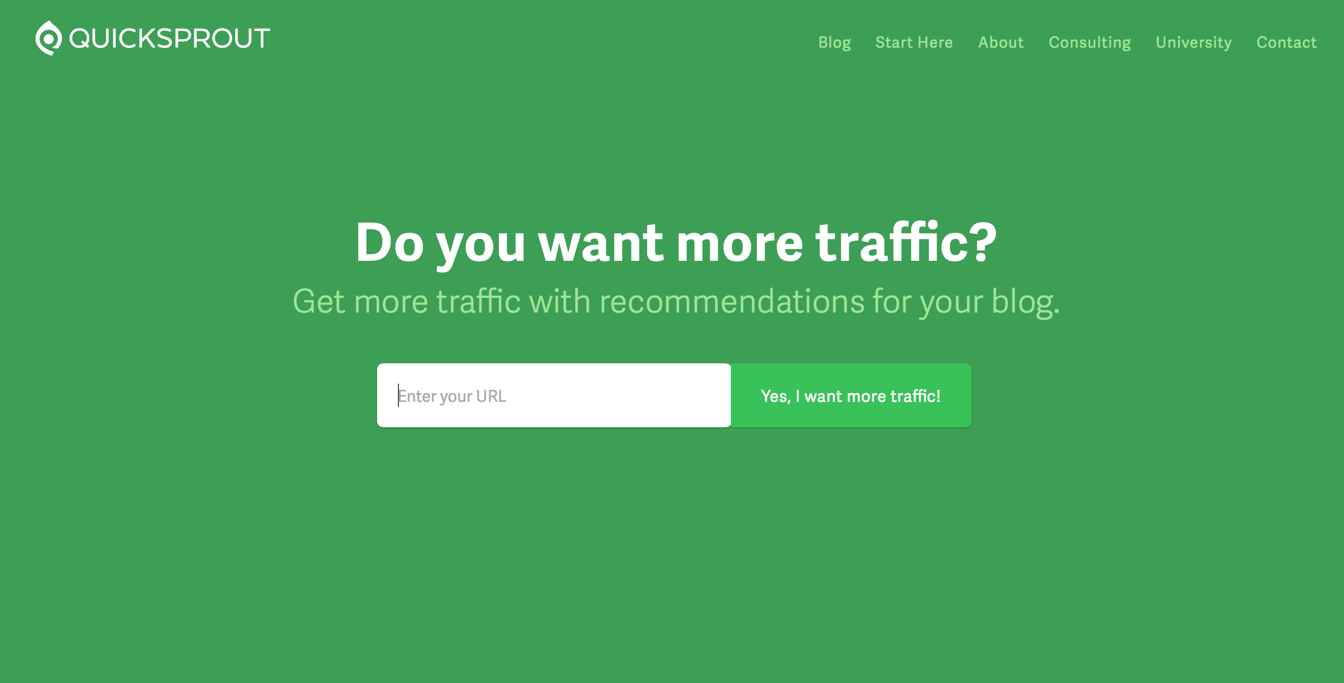
QuickSprout – Full Page Call To Action
QuickSprout’s homepage is truly optimized to skyrocket the conversion rate for any new visitor. Featuring a bold headline and a call to action where you can fill your website address, the simple elegant design ensures that new visitors are not distracted by any unnecessary information when they first visit their site. Although their homepage features a navigation bar, the background colour for the entire page stays consistent preventing the visitor from getting distracted.
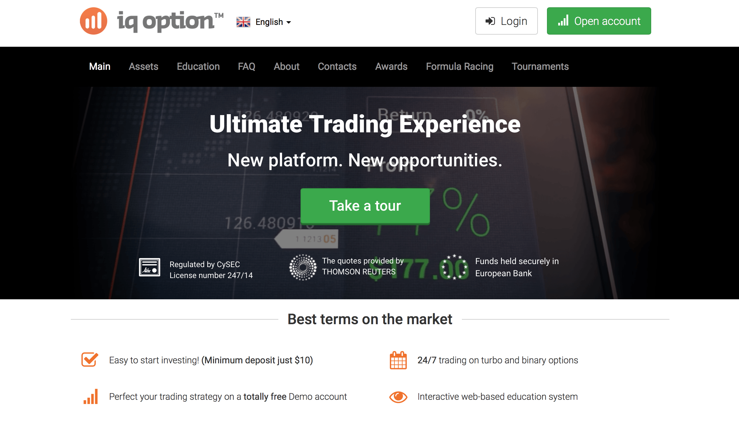
iQ Option – Multiple Call To Action
This is a Binary Option website which is known for converting a lot of people into new customers. Watch below how they use a main Call to Action at the centre to take a tour and a secondary green button on the top left asking users to open a new account one they have taken the tour.
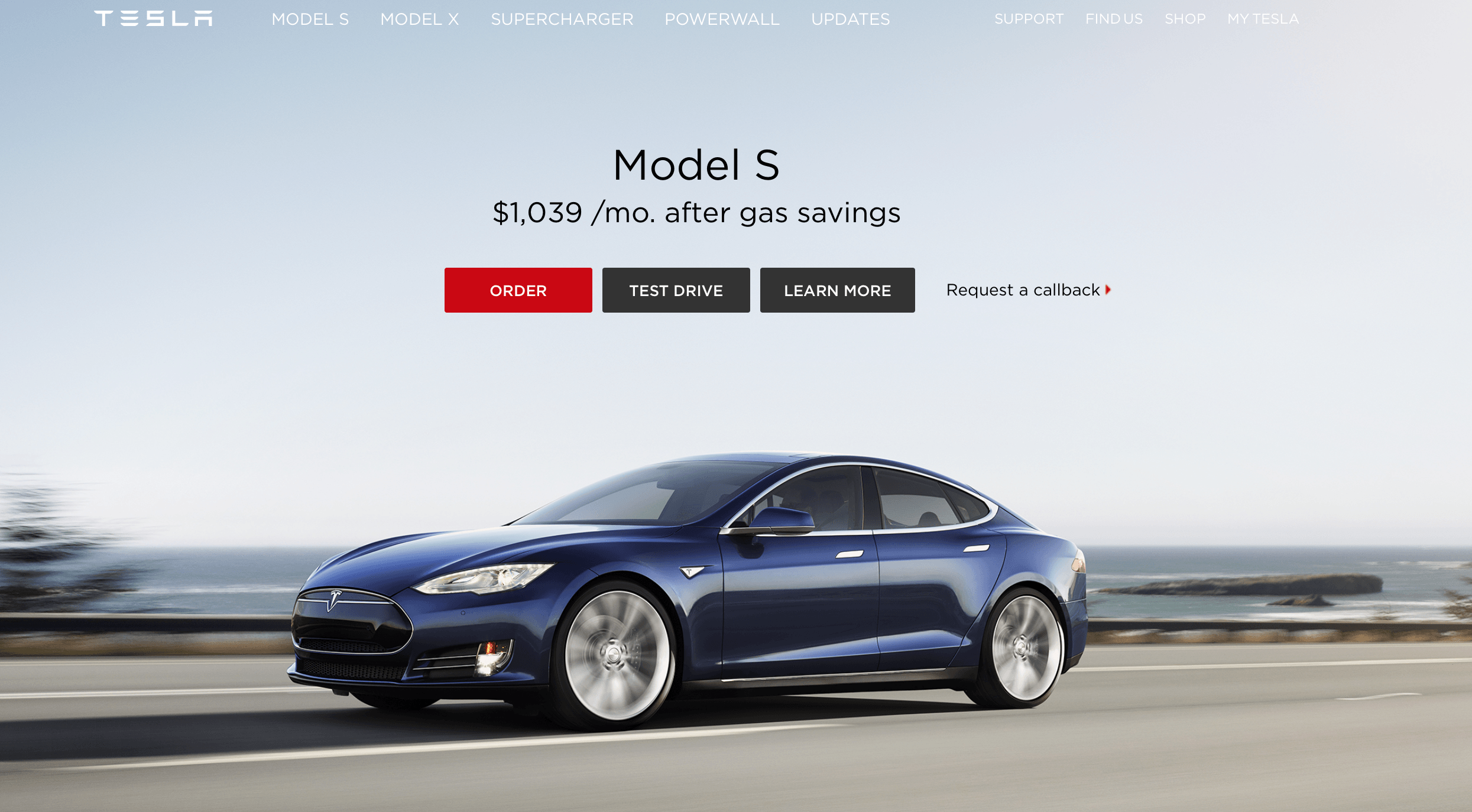
Tesla – Using Colours To Attract Attention
Tesla’s recent landing page focuses on using contrasting colours for their Call To Action Button. The “Order Now” button is coloured in red in order to attract even more attention to it. On the flipside you can see that request a callback is just a simple text which means they prefer to take some sort of an action online compared to leaving your number for a callback.
Hubspot HomePage – Multiple Products
Hubspot’s new homepage features 3 prominent sections featuring their sales platform, marketing platform and a bigger section for users who are interested in some of their latest features. Each button takes users to a specific page explaining things in greater detail.

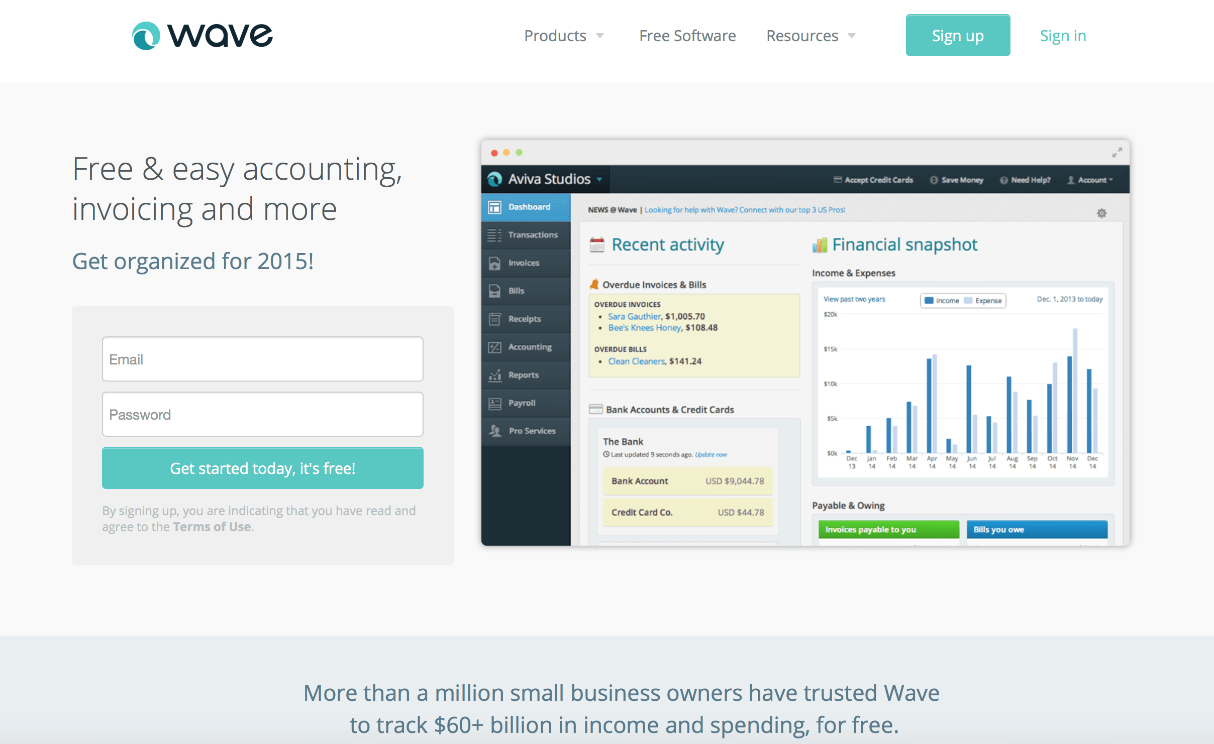
Wave Accounting – Signup Form Right Below Headline
Wave is a free cloud accounting software. Their new homepage features a 2 field signup form right below their headline. The white background coupled with a green call to action button immediately grabs your attention. There is a beautiful illustration of how the software looks on the right. This design is generally works well if you are trying to get users to signup or just get their email address for some sort of a subscription.
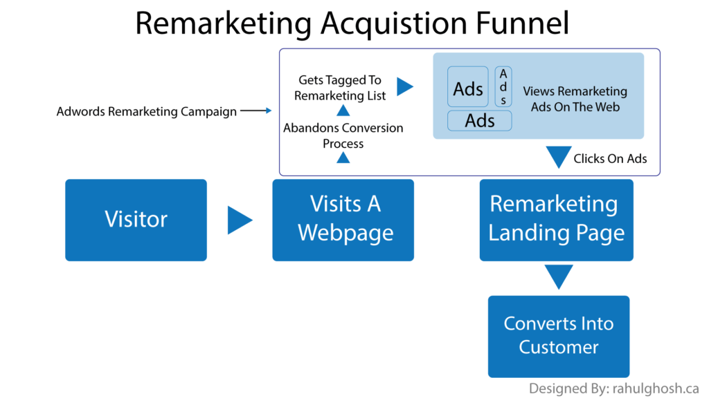
Google Adwords – Sidescroll To Action
Whenever we talk about landing pages we focus on having a good flow as a user scrolls down to read more about your offer. This is where Google Adwords landing page differs from the crowd. Instead of using a vertical navigation it uses a series of tabs to showcase some of the reasons why you should use Google Adwords. Each tab has the same blue button called “Start Now” allowing a visitor to get started from within any of it’s tab. The overall design is very clean and simple with the main focus on text and illustrations.
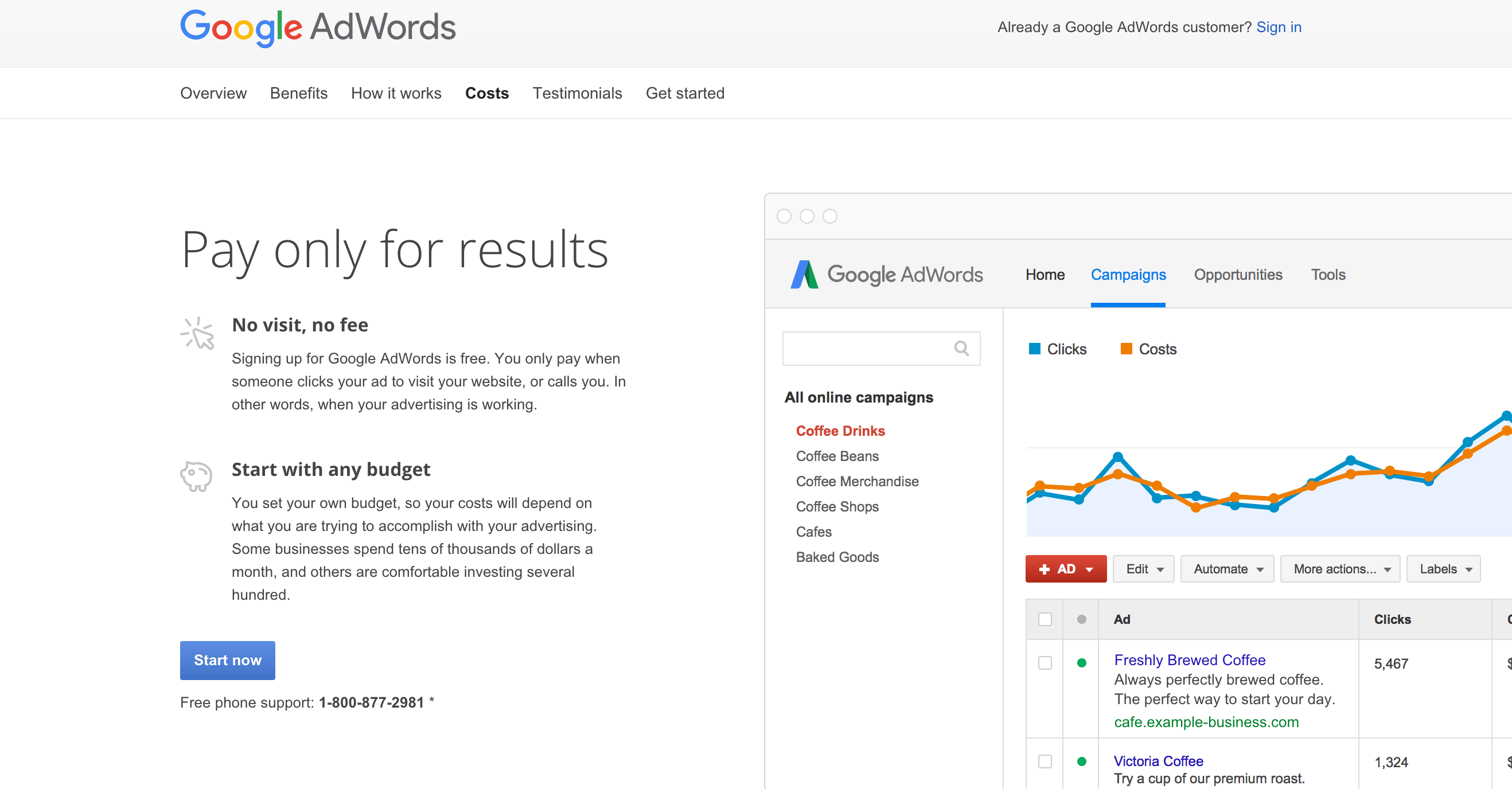
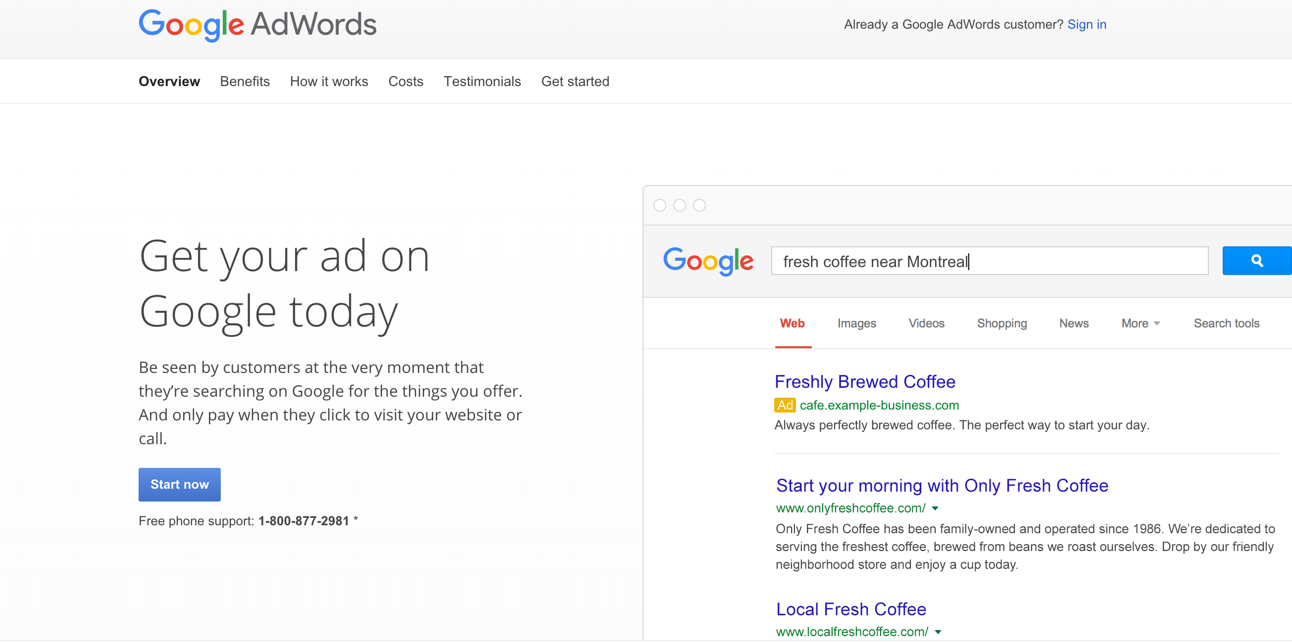
Sliding The Adwords Page Reveals Different Section
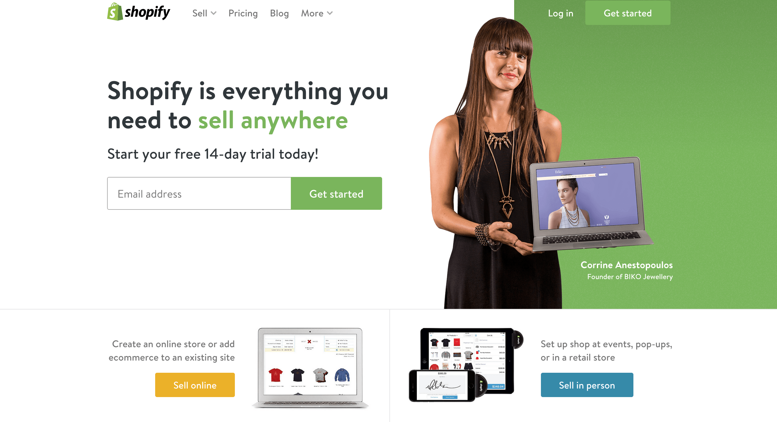
Shopify – Using Real Customers to Build Instant Trust
Shopify’s homepage focuses on getting you to sign up for their e-commerce service. In order to build an instant connection with new users they are using a real world person who built a successful e-commerce store using the Shopify platform. Using real people builds trust which is a vital ingredient if you are looking to convert a lead into a customer.
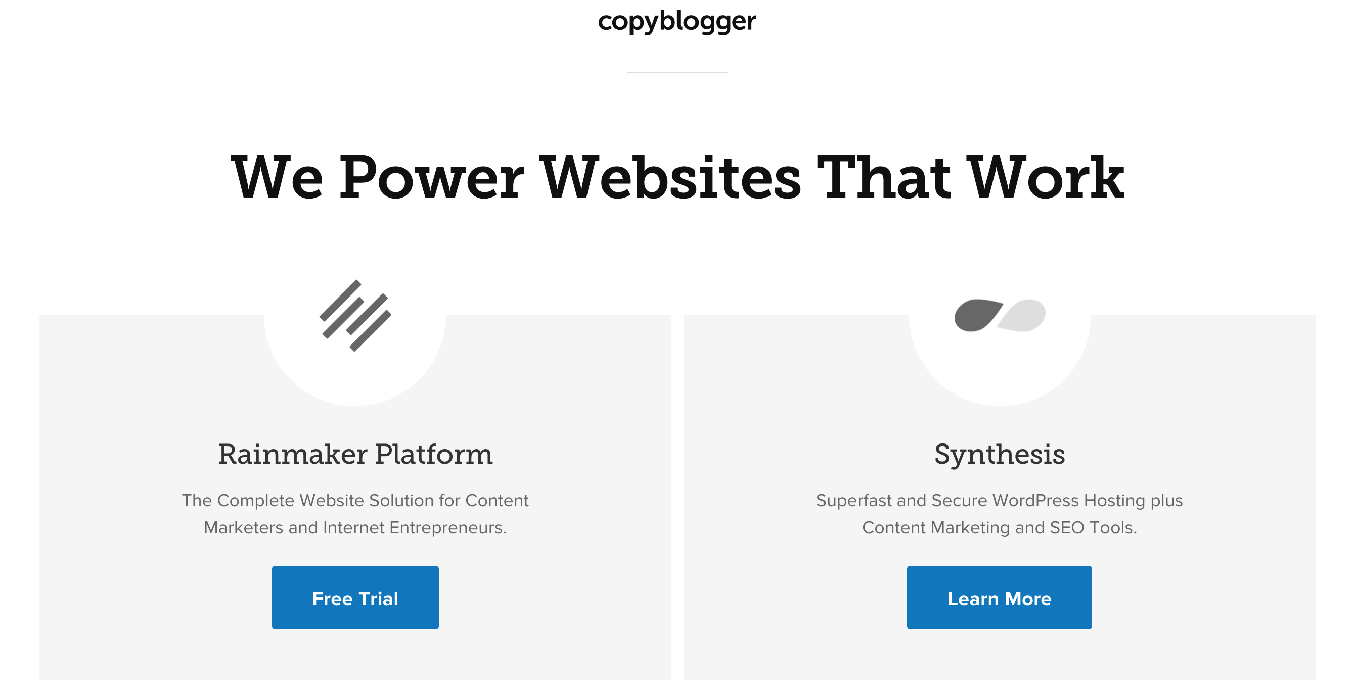
CopyBlogger – Symmetrical CTA
Copyblogger’s homepage challenges conventional landing page best practices in many ways. If you take a look at the image below you will see that they are promoting two different call-to-actions (CTA) side by side by splitting your attention into half. Rainmaker and Synthesis are both services that operate under the CopyBlogger brand name. Using lots of white space and a bold text headline what they are doing is letting on focus on the phrase “We power websites that work”. Now they offer two separate sections for 2 different solutions. I really liked their concept and it’s extremely high converting or so I heard.
Unbounce Homepage – Step by Step Illustration
Unbounce is a landing page builder on the cloud. It’s only fair to assume that their own homepage would follow all the conventional tactics of a high converting landing page. A clear blue background allows the text on top to pop even more. The call to action button is orange and the reason why they choose that is because orange and blue are complementary colours allowing both of them to co-exist with their own distinct identity in a given space. Followed by the descriptive CTA we have a step by step illustration of their service. Step by step illustrations, if portrayed in a simple way can be highly attractive in converting new users to customers.

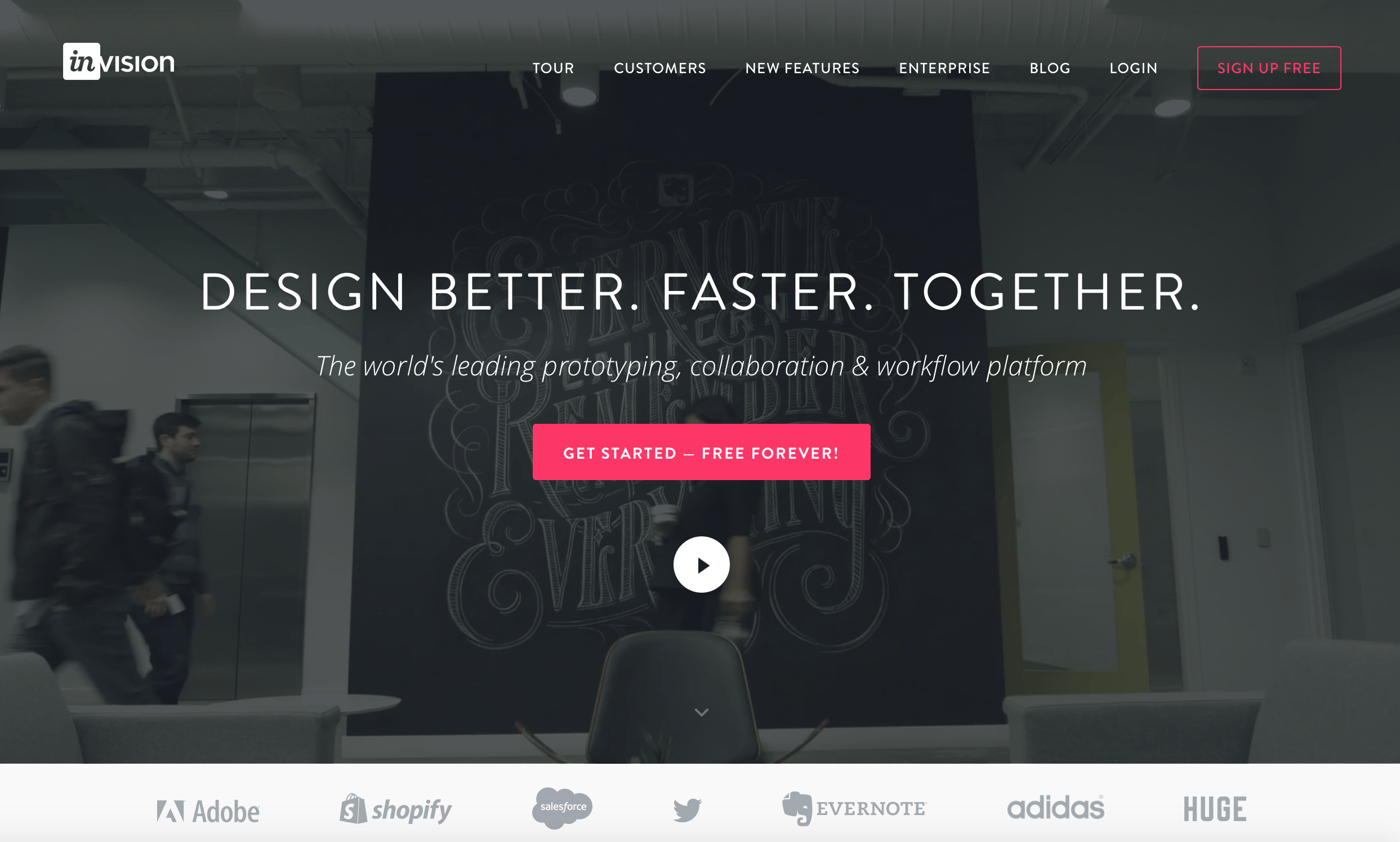
Invision – Video Background To Grab Attention
Invasion allows designers to collaborate and share their work in an organization. If you visit the homepage of InVision then you will come across a full page video background with a call to action on top. The video is dimmed slightly allowing you to focus on both the video as well as the text on top. Once you scroll down you have a clear explanation of their most important features with relevant illustrations. Overall their landing page is clean and crisp.
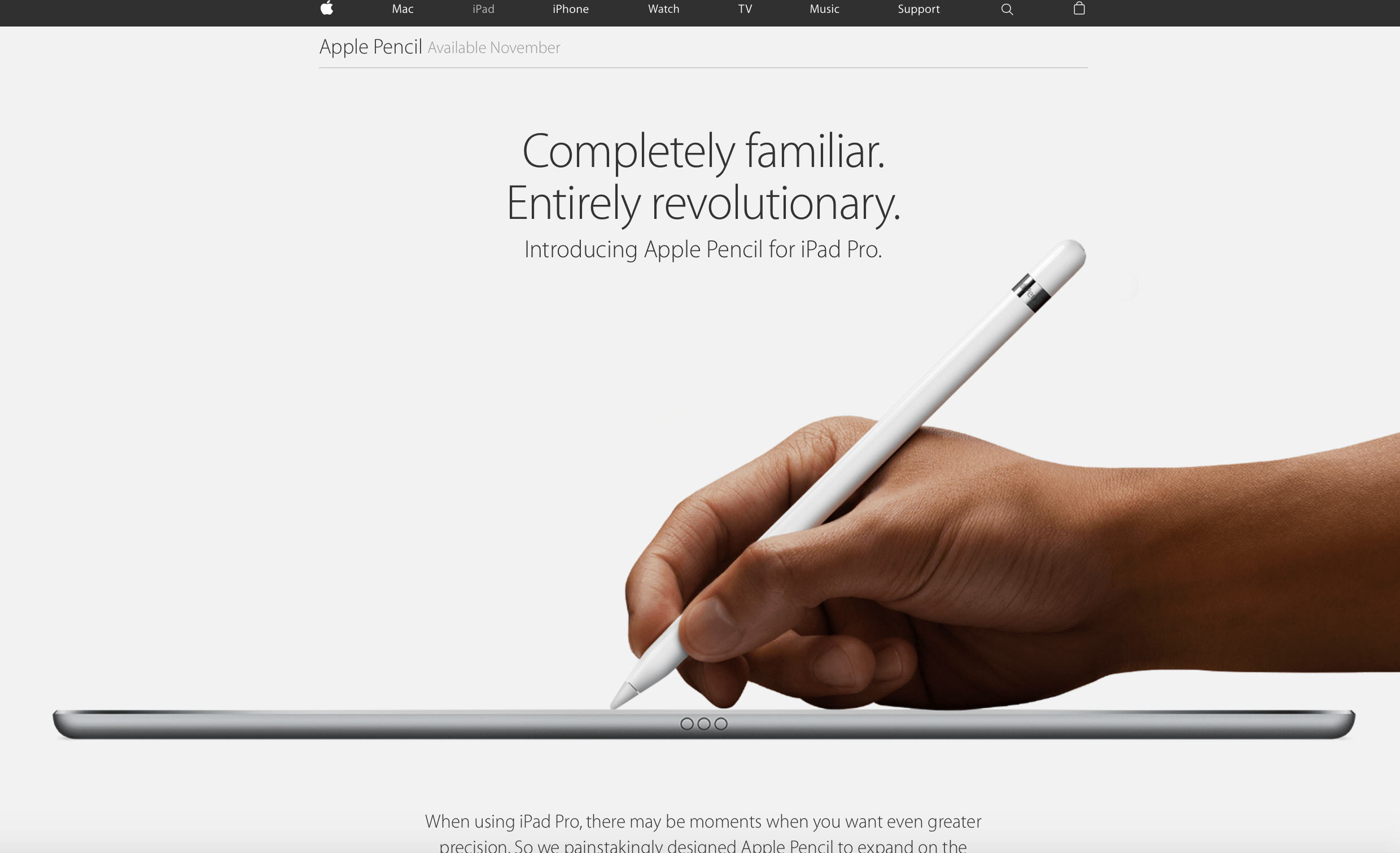
Apple Pencil – High Resolution Photos Of Product
If you have a physical product that you are trying to sell then the new Apple Pencil landing page is something you should definitely take a look at. Complying with Apple’s grey and white colour combination their landing page provides users with extremely high resolution responsive pictures of the product with clear text explaining some of the features. Throughout the page you will come across multiple call to actions and a buy now button on the top navigation bar. Also, it’s important to notice that when you scroll the navigation bar changes into something focussed specifically towards the product.
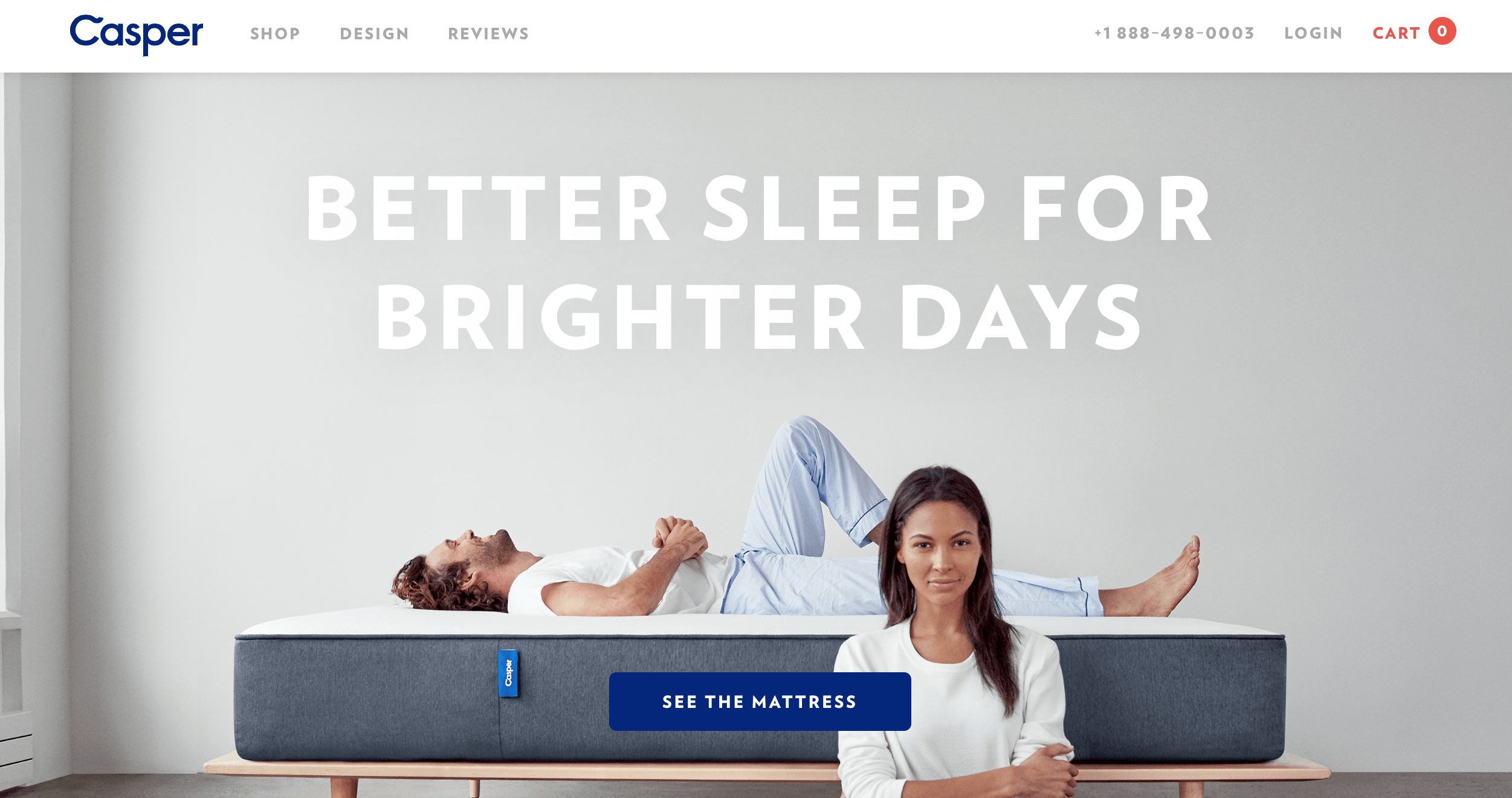
Casper Mattress – Single Page E-Commerce
Casper Mattress has a beautiful homepage that gives you a real insight about their product with a cohesive layout. A simple call to action button takes you to the product checkout page where you are presented with different options to choose from before placing the order. I like how the website flows from the homepage to the checkout page and it’s an effortless experience for a first time buyer.
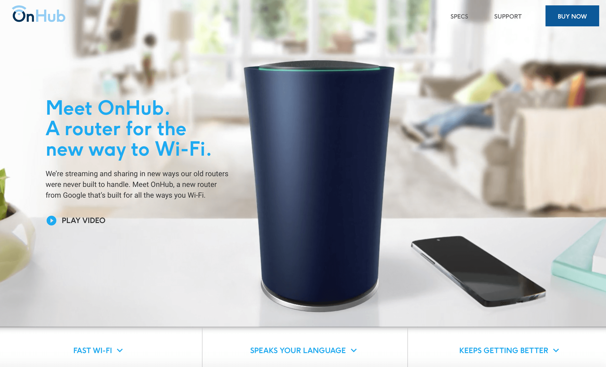
Google OnHub – Reinventing A Product
Google’s OnHub is a brand new wi-fi router. While there are tons of routers out there, OnHub’s landing page really gives you enough reason to order their over-expensive product. To start with, they play a quick intro video that finally blends with the a static image forming the pillar of the page. Once you start scrolling you will come across all the familiar features that a router provides but with interesting images and a great style of writing to peak your interest. Finally, if you are ready to buy there is a big blue button on top left that takes you to the order page.
These are some of the best landing pages that I found on the internet. A little bit of disclaimer that I would like to write is that I tested them as of this post’s article so it’s very much possible that they can change or alter the designs if you are reading this post in the future.

0 Comments